
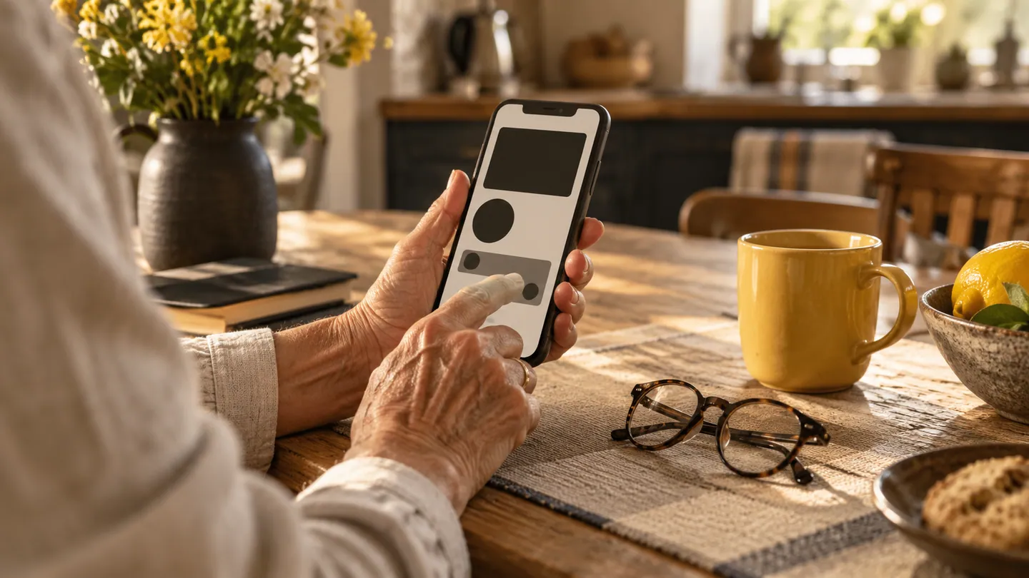
Mobile accessibility is easiest to understand through a task. Can a customer book a service, read the confirmation and correct a mistake using their preferred device settings? A screen can look tidy in a design review while becoming difficult when text grows or a screen reader is enabled. Treat these conditions as ordinary ways of using the app, beginning with its most important journey.
Start with structure and meaning
A delivery app might show a coloured dot for each order status. Add a clear text label so the meaning does not depend on colour. Buttons should announce their purpose rather than an internal icon name, and the reading order should follow the visible task. Group a date with its appointment so it is not heard as an unexplained number. Android's accessibility testing guidance includes assistive-technology checks and automated tools. Use both as aids, while remembering that a clean automated result does not demonstrate an understandable booking experience.
Let the interface adapt
Increase the device text size and inspect every consequential screen, including error messages and confirmation dialogs. Content should wrap or scroll sensibly rather than overlap the action button. Avoid relying on a precise swipe or a tiny target as the only way to perform a task. A customer managing arthritis, carrying groceries or using a phone outdoors may encounter the same awkward control for different reasons. When animation explains a status change, provide a persistent textual result as well. Movement should support comprehension rather than be required to understand what happened.
Test with people and realistic data
Use long names, lengthy addresses and a booking containing several services. Complete the journey with the screen reader, including a validation error, a return to an earlier step and an interrupted session. Invite people with relevant access needs to try the app and compensate them appropriately for their time. Ask where meaning became unclear, not whether they liked the colours. Keep accessibility checks in release review so a new promotion banner or redesigned form does not block a previously usable route. Record resolved issues in terms of the task restored.
- Can each essential action be found and understood without interpreting an icon?
- What happens to the final confirmation screen at the largest supported text settings?
- Is there an alternative to any precise gesture required by the workflow?
- Have people with relevant access needs tried the complete journey, including mistakes?