
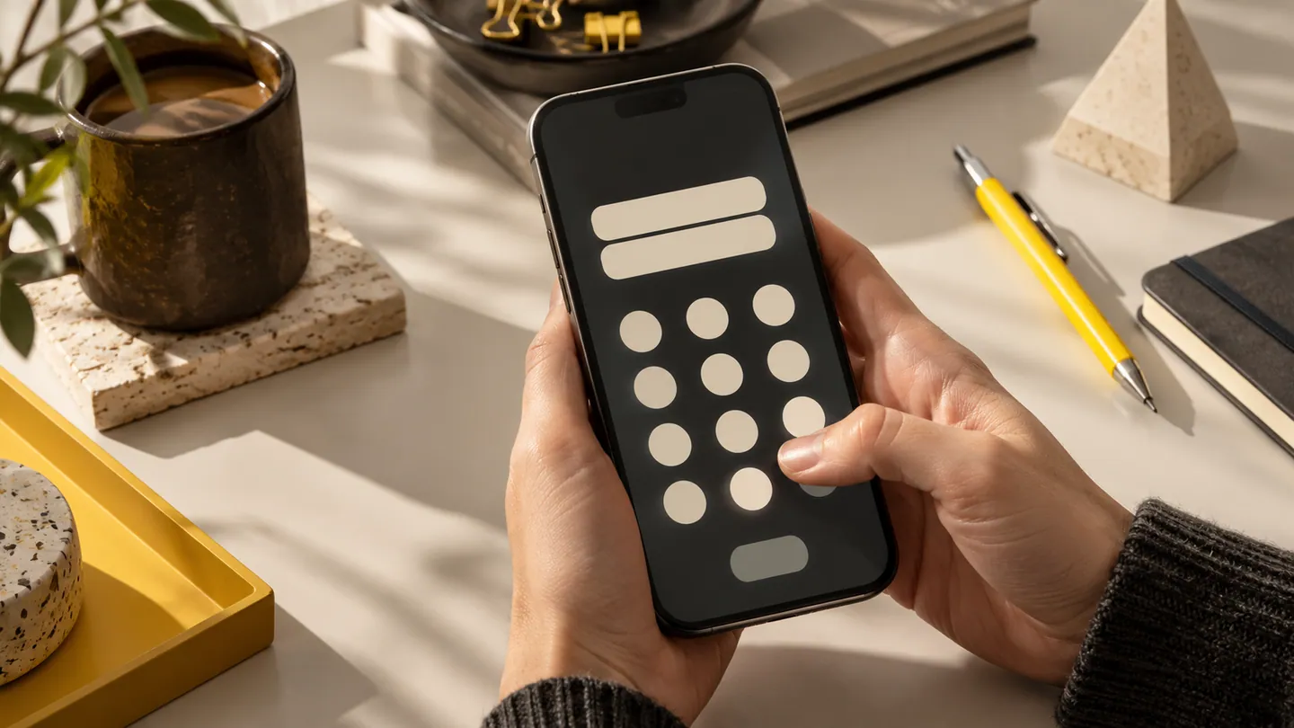
A form that feels short on a laptop can become laborious on a phone. The keyboard covers much of the screen, a thumb hits the wrong character and an address may not fit the expected pattern. Improving mobile input often delivers more value than adding another feature. Start by questioning each field, then choose controls that match the information being entered.
Ask for information used in the task
A pool-maintenance booking may need the service address and access instructions, but not a long profile questionnaire before the first visit. Remove duplicate fields and explain uncommon requests. Keep labels visible after typing so the customer can review what each value means. For measurements, show the unit beside the input rather than hiding it in introductory text. Provide relevant choices where they reduce effort, but allow a truthful exception when the list cannot cover real circumstances. A forced inaccurate answer creates downstream work that a neat form cannot justify.
Treat the keyboard as part of the layout
Test email, phone, number and free-text fields with suitable keyboard behaviour on each platform. Make the next action clear and avoid hiding validation beneath the keyboard. Allow pasting where appropriate and avoid automatic formatting that unexpectedly moves the cursor while someone corrects an entry. Check Australian addresses with units, property names and regional descriptions rather than accepting only simple suburban examples. Android's accessibility testing guidance is useful for checking focus and interaction; complete the form with assistive technology as well as ordinary touch input.
Help people correct mistakes locally
Place an understandable error near the affected field and preserve valid entries elsewhere. A general message at the top should not force someone to search a long form for the problem. Explain the expected value with an example when that is more useful than a rule. Validate at a considerate moment rather than criticising every incomplete keystroke. Test a deliberate mistake, a back navigation and a return after interruption. The final review should show the entered information in customer language, giving people a chance to catch a wrong address or quantity before commitment.
- What business decision or action uses each field in this form?
- Can a customer review labels and errors while the keyboard is open?
- Do address and name fields support the real variation in your customer base?
- Can someone correct one mistake without re-entering information that was already valid?